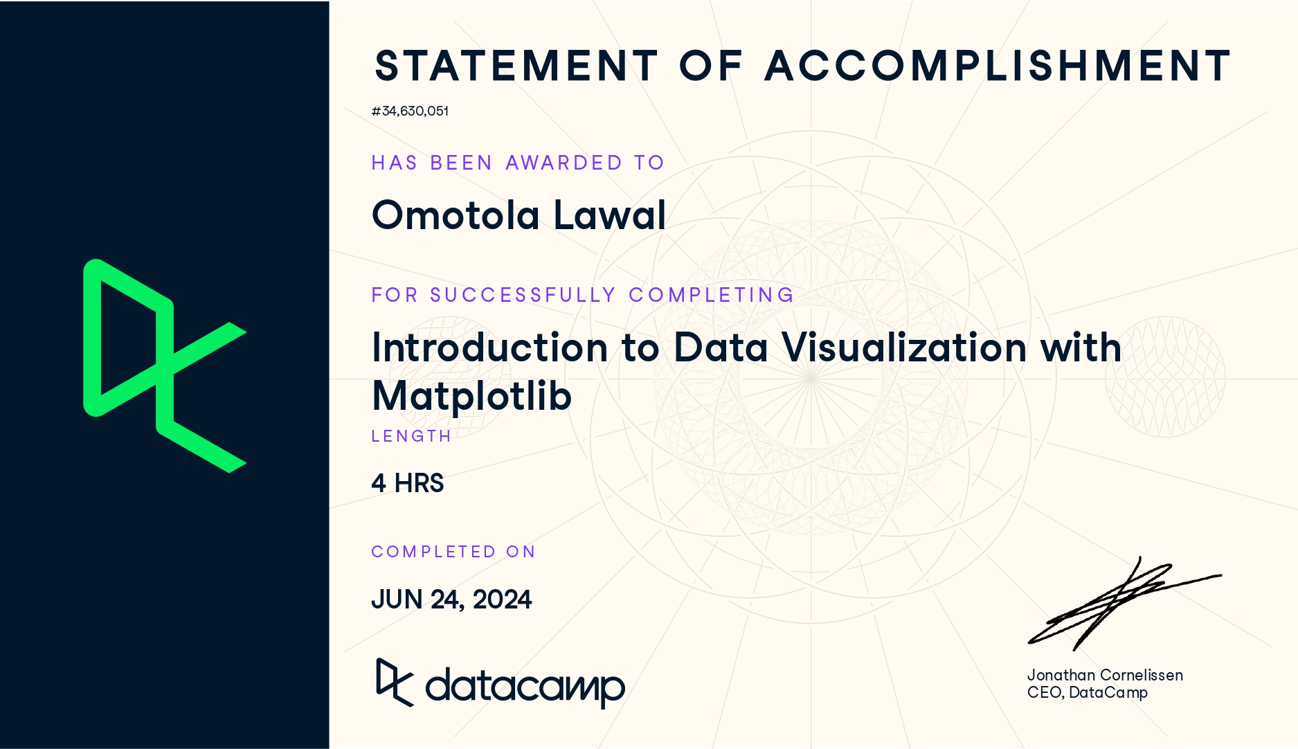
Completing the Introduction to Data Visualization with Matplotlib course has been a defining step in strengthening my data communication skills. It deepened my understanding of how visuals translate complex datasets into clear, compelling insights. From learning the fundamentals of the pyplot interface to customizing charts and creating small multiples, I began to see how visual storytelling enhances the way data is interpreted and shared.
1. Plotting Fundamentals
- Learned how to create and customize basic plots such as line charts, bar plots, scatterplots, and histograms.
- Explored the Matplotlib object hierarchy, understanding the relationship between
Figure,Axes, andAxis. - Practiced styling elements like titles, labels, legends, and annotations for better visual clarity.
- Improved layout design using subplots and figure size adjustments.
2. Advanced Visualization Techniques
- Used color palettes, markers, and line styles to enhance storytelling.
- Practiced overlaying multiple datasets and controlling plot aesthetics through
matplotlib.pyplot. - Created stacked bar charts and grouped visualizations for comparative analysis.
- Integrated text annotations and arrows to emphasize insights in plots.
3. Customization and Design
- Learned to fine-tune plots using custom themes, style sheets, and grid controls.
- Explored how to use ticks, labels, and limits to improve readability.
- Understood how design choices influence perception and interpretation of data.
- Practiced saving figures in multiple formats for reports and presentations.
Check here for details.